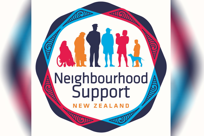
Neighbourhood Support NZ is bringing a fresh look with the launch of a new logo.
'There has been a lot of change since we first established ourselves as a not-for-profit in the 90s,” says Kathy Webb, Chair for Western BOP Neighbourhood Support.
'Our members felt that it was time to ensure the ‘face' of Neighbourhood Support kept up with where we are headed as an organisation.”
The new logo is a colourful update of the existing design. The latest design features a nod to NZ' emergency services partners, as well as a better representation of the neighbours, members and supporters who make up the growing organisation.
Kathy says the updated logo also features a koru pattern which reflects the important place of taha Maori in Aotearoa New Zealand. The colours chosen symbolise Neighbourhood Support's vison of inclusive communities, where everyone is welcome and belongs while the blue colour represents their ongoing partnership with New Zealand Police.
'The bright colours reflect the positivity and energy that is created when people work together to create safer, caring and more connected communities,” says Tess Casey, CEO of Neighbourhood Support NZ.
'The rebrand is an exciting opportunity to better reflect the increasing number of people we support.
'Our feedback shows that New Zealanders want to be part of neighbourhoods where people know and support each other. Increasing numbers of people are reporting that they feel isolated or lonely, so knowing that you are a part of a neighbourhood that looks out for each other helps people feel safer and more connected. Here in the Western Bay of Plenty over 15,000 homes are networked.”
To learn more about creating safer, more caring and connect streets in your area, visit the Western BOP Neighbourhood Support website here: www.wbopns.org.nz


0 comments
Leave a Comment
You must be logged in to make a comment.